
By Donald Luverne
There's a question I ask owner-operators when I first sit down with them: what did you net last May? Not gross... net. What actually landed in your pocket after fuel, payments, insurance, and everything else came out?
Most can't answer it. Not because they're not paying attention to their business, but because they've never had a system that tracked it. They know roughly what they earned. They have a general sense of what things cost, but the actual net margin the business produced after all the bills were paid, lives somewhere in a pile of receipts and bank statements they haven't reconciled since last tax season.
That's the specific problem the Cost Per Mile Analyzer's history and dashboard tools were built to solve. Not just for last month. For every month, going back as far as you want to track.
The history system works simply. Each month, you enter your operating data in the Inputs tab; total miles, loaded miles, your fixed costs, your variable costs per mile, fuel data, and gross revenue. Click Save. That month is recorded permanently in the history log.
The log captures everything the calculations need: your Cost Per Mile broken down into fixed, variable, and fuel components. Your Break-Even Rate. Your Loaded Mile percentage. Your estimated net income. Month after month, the picture of your business builds itself.
You can also backfill history. If you want to go back two years and enter what you actually ran, the tool supports it. Add earlier months automatically through the History Entry Form and you'll have a complete baseline to measure against going forward. Most operators who do this find out things about their own business they didn't expect — seasonal patterns they weren't tracking, a slow drift upward in costs they hadn't noticed, a few months where the numbers were genuinely good and they didn't know why.
Once you have history built up, the Dashboard tab is where it comes alive. Five KPI tiles across the top give you the current month at a glance; Total CPM, Break-Even Rate, Estimated Net Income, Loaded Mile %, and Average MPG. Each tile shows the current value, a month-over-month trend indicator, and a status signal so you know immediately whether you're in good shape, watching something, or dealing with a problem.
The status dots aren't arbitrary. They're calculated against real benchmarks; the ATRI Operational Costs of Trucking industry average for CPM, the 80% threshold for loaded mile efficiency, the Class 8 fleet average for MPG. When a dot turns red, it means your number has crossed a line that matters in the real world, not just compared to your own history.
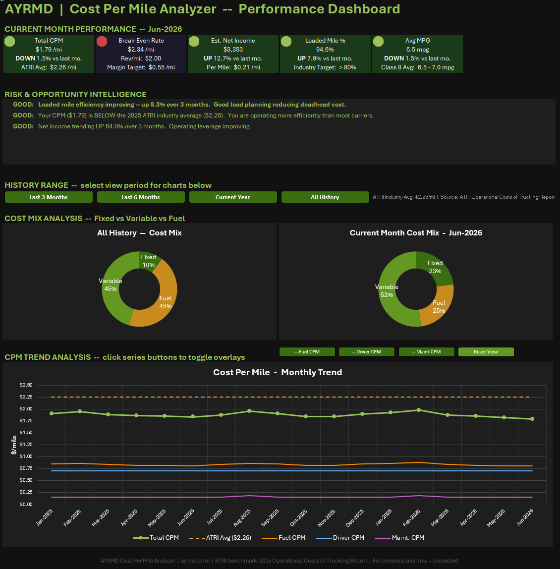
Below the KPI tiles, the Risk and Opportunity Intelligence panel does something most business tools don't bother with: it tells you what your trends actually mean.
The panel reads your last three months of data and auto-generates specific observations. MPG declining more than five percent... flagged, with the estimated fuel cost impact calculated. Loaded mile efficiency dropping... flagged, with a note to look at lane selection and backhaul planning. CPM running above the ATRI benchmark... flagged, with how far above and what categories to review. Net income improving... noted, with context on what's driving it.
These aren't generic alerts. They're calculated from your actual numbers, expressed in dollar terms where possible, and prioritized by financial impact. The panel doesn't tell you things you already know. It surfaces the things you might have missed.
The CPM Trend chart at the bottom of the dashboard plots your Cost Per Mile month by month against the ATRI industry benchmark — a dashed reference line showing what the average carrier spends per mile to operate. If your line runs consistently below the benchmark, you're more cost-efficient than most. If it's trending upward toward or above it, you have a cost problem developing.
Four range selector buttons let you filter the view to the last three months, last six months, current year, or your full history. Toggle overlays let you add Fuel CPM, Driver CPM, or Maintenance CPM as additional series so you can see exactly which cost component is driving any trend you spot.
Most operators who use the dashboard consistently for a few months say the same thing: they start making different decisions. Not because the tool tells them what to do, but because they finally have a clear picture of what their decisions have been producing.
The Cost Per Mile Analyzer is $19, one time. The history and dashboard tools are included; no add-ons, no tiers, no monthly subscriptions to keep your data accessible. Download it once, run it for as long as you're in business.
If you've been running without a clear record of what your operation actually costs and produces, this is where to start.